Roomii Display
Typeface Design
Roomii Display
Typeface Design
Roomii Display
Typeface Design
Roomii Display
Typeface Design
Roomii Display
Typeface Design
2024
2024
2024
2024
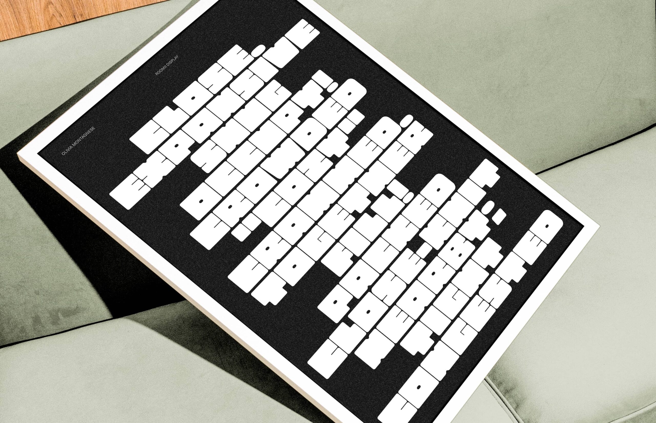
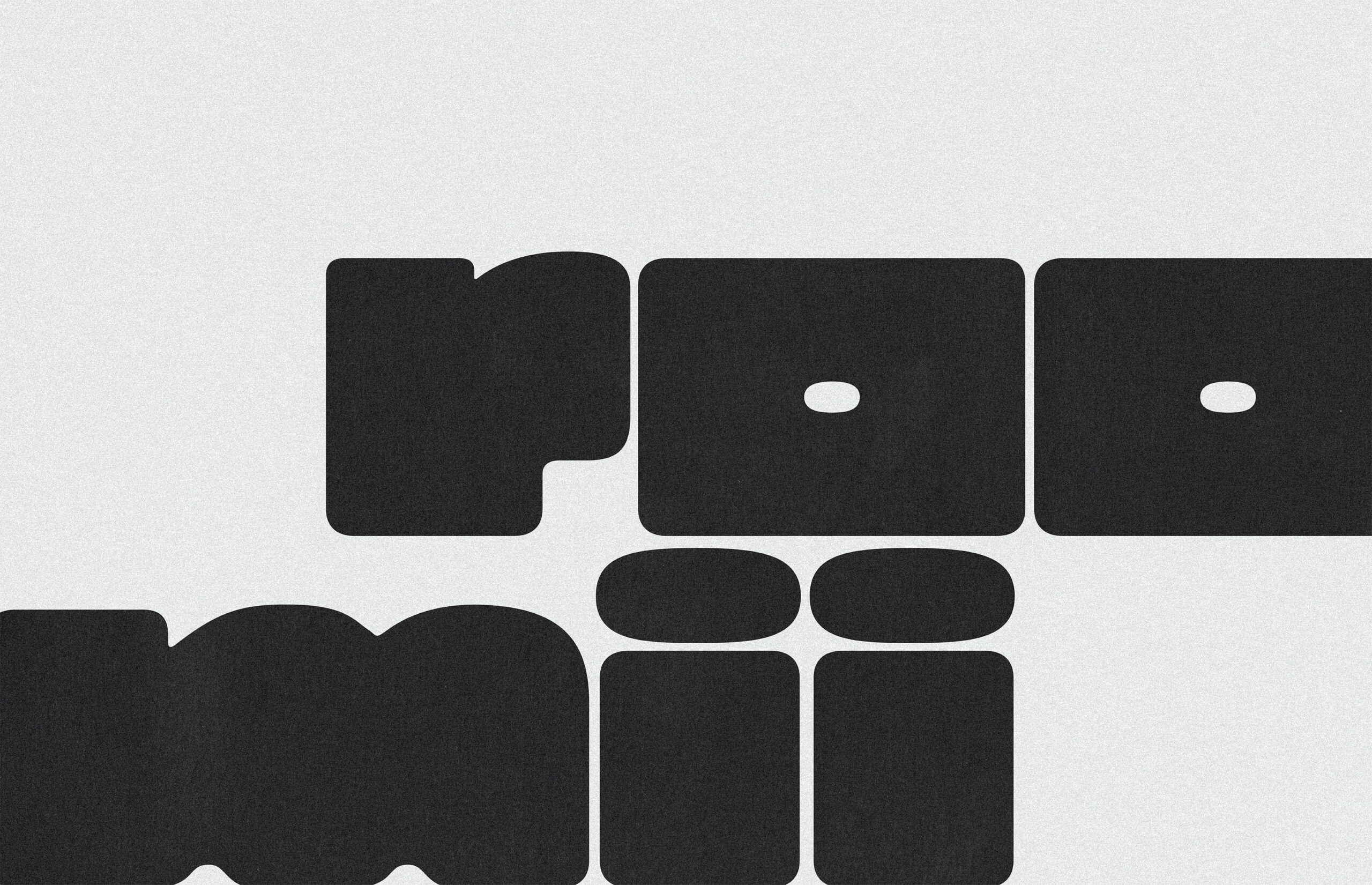
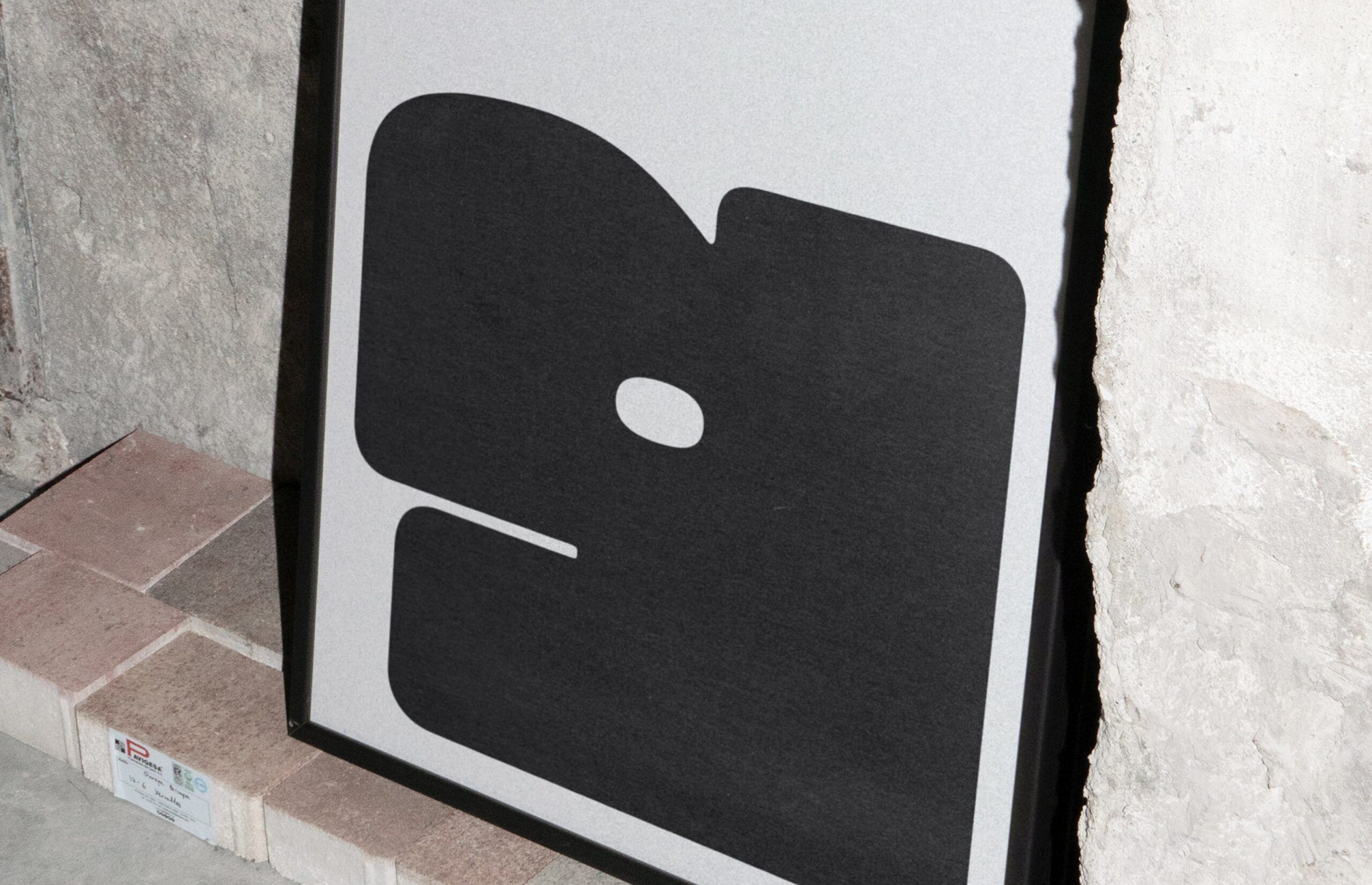
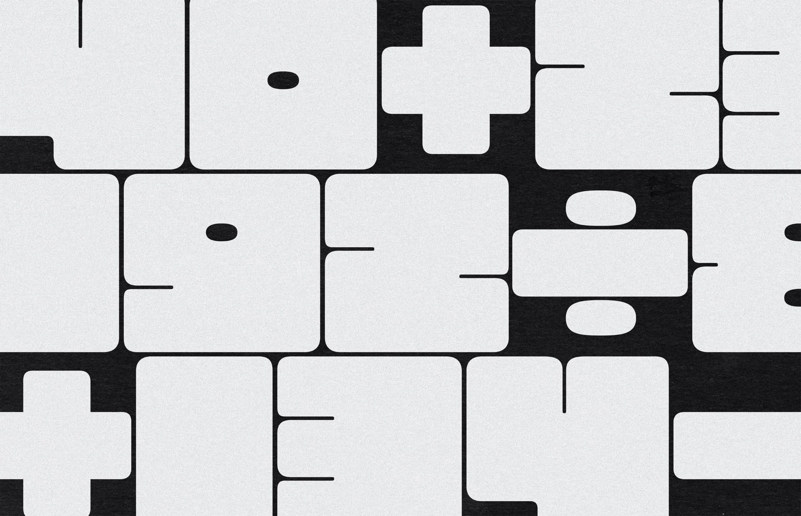
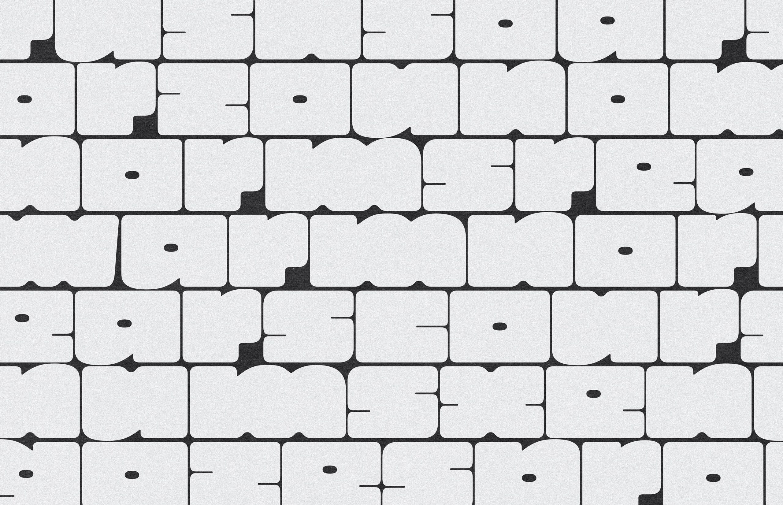
Roomii Display is a typeface that isn’t afraid to take up all the space and room. This chunky sans serif features rounded rectangular letterforms, a modular structure, very small counters, and a retro-futuristic aesthetic. Balancing on the edge of abstraction, Roomii Display blends clarity with a hint of artistic distortion.
Strategy
My interest in typeface design began during my final year of school, where I briefly experimented with font creation. Since then, I’ve wanted to learn more about typeface design and create fonts, as I dream of one day (in the very distant future) working as a type designer at a small foundry. This past fall, I took a 10-week virtual course through Type@Cooper, taught by Zrinka Buljubašić. Going into the course, I put immense pressure on myself to create something exceptional by the end of it. I felt the need to have a fully cohesive strategy or direction from the start, which stressed me out before the course had even begun. Instead, I challenged this mindset by focusing on the learning process—allowing myself to experiment, take risks, and even be okay with failing. This shift in perspective is difficult, yet it’s something I’m actively working on when approaching new learning experiences.
Experience
The first half of the course focused on writing letterforms with various tools to better understand construction, contrast, rhythm, and spacing. I practiced both translation and expansion writing using broad and pointed nibs, which deepened my understanding of letterforms. Each week, I dedicated time to sketching and refining my technique, which helped me grow more comfortable with the tools. At the same time, I explored ideas for my typeface, finding inspiration and sketching extensively, knowing these sketches would be the foundation for digitization. Naturally, I gravitated toward creating a chunky display typeface, as it offered more room for experimentation and allowed for greater personality and expression.
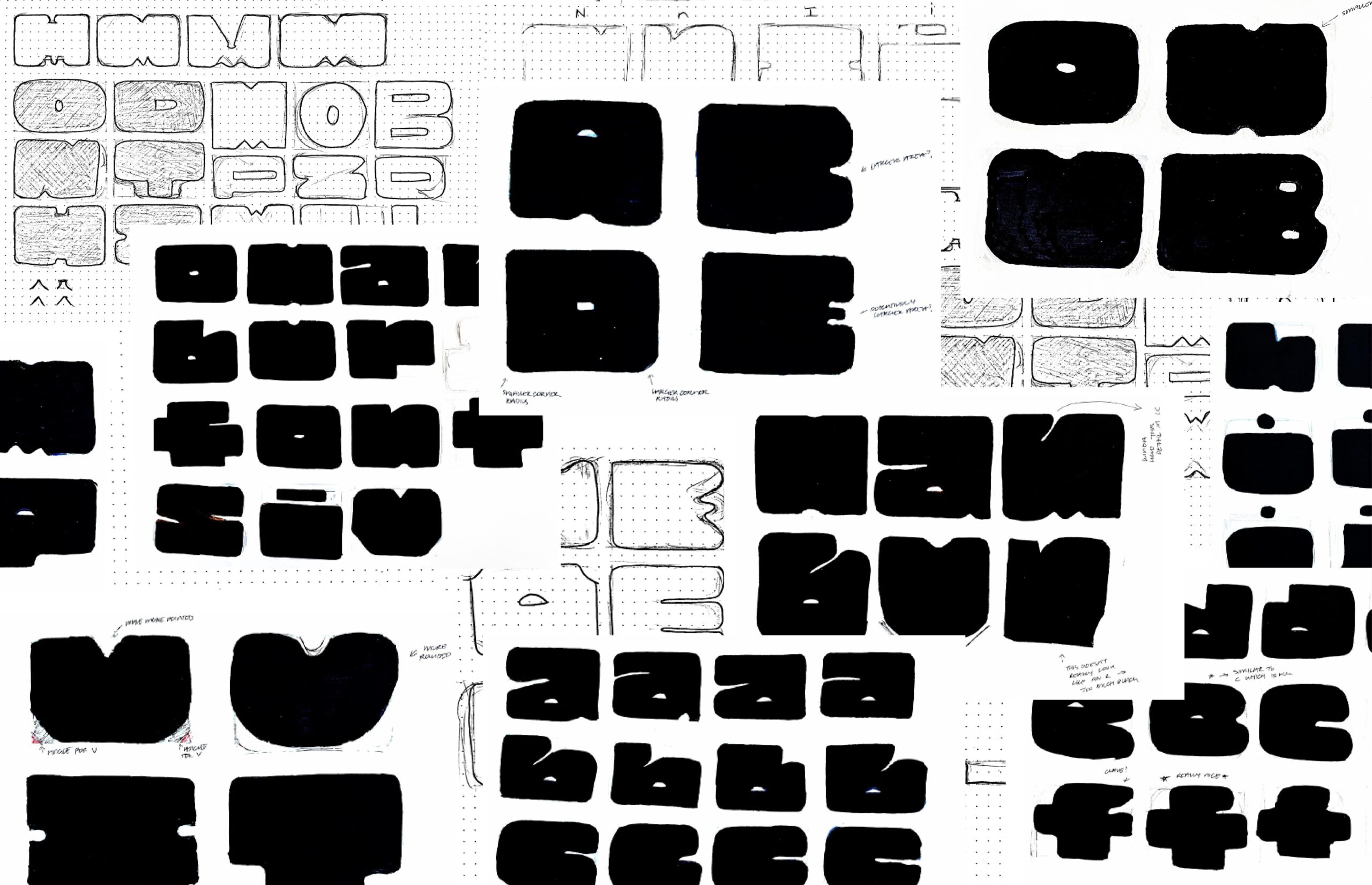
As I continued refining my sketches, a significant shift in my approach occurred when I moved from sketching outlined forms to filled forms. Given the heavy weight of my typeface, my instructor encouraged me to think of my letterforms as vessels filled with black ink, aiming for an even distribution of ink across all the letterforms so they would all appear to have the same weight. She also highlighted the importance of the counters in my letterforms, noting that their size and placement play a key role in distinguishing one letter from another. Prior to this, I had been rigidly confining my forms within a gridded rectangle—an arbitrary rule I had created for myself—that limited my design process.
I spent my nights sketching away with my concoction of Sharpie and White-Out, windows open, fully immersed in the process. Watching my sketches evolve through each iteration was fascinating. I found uppercase letters easier to draw, but transitioning to lowercase was difficult. Adapting the same stylistic approach to their more complex forms proved to be a significant challenge for me. Weekly class critiques were invaluable, providing insightful feedback that helped me refine and further develop my typeface.
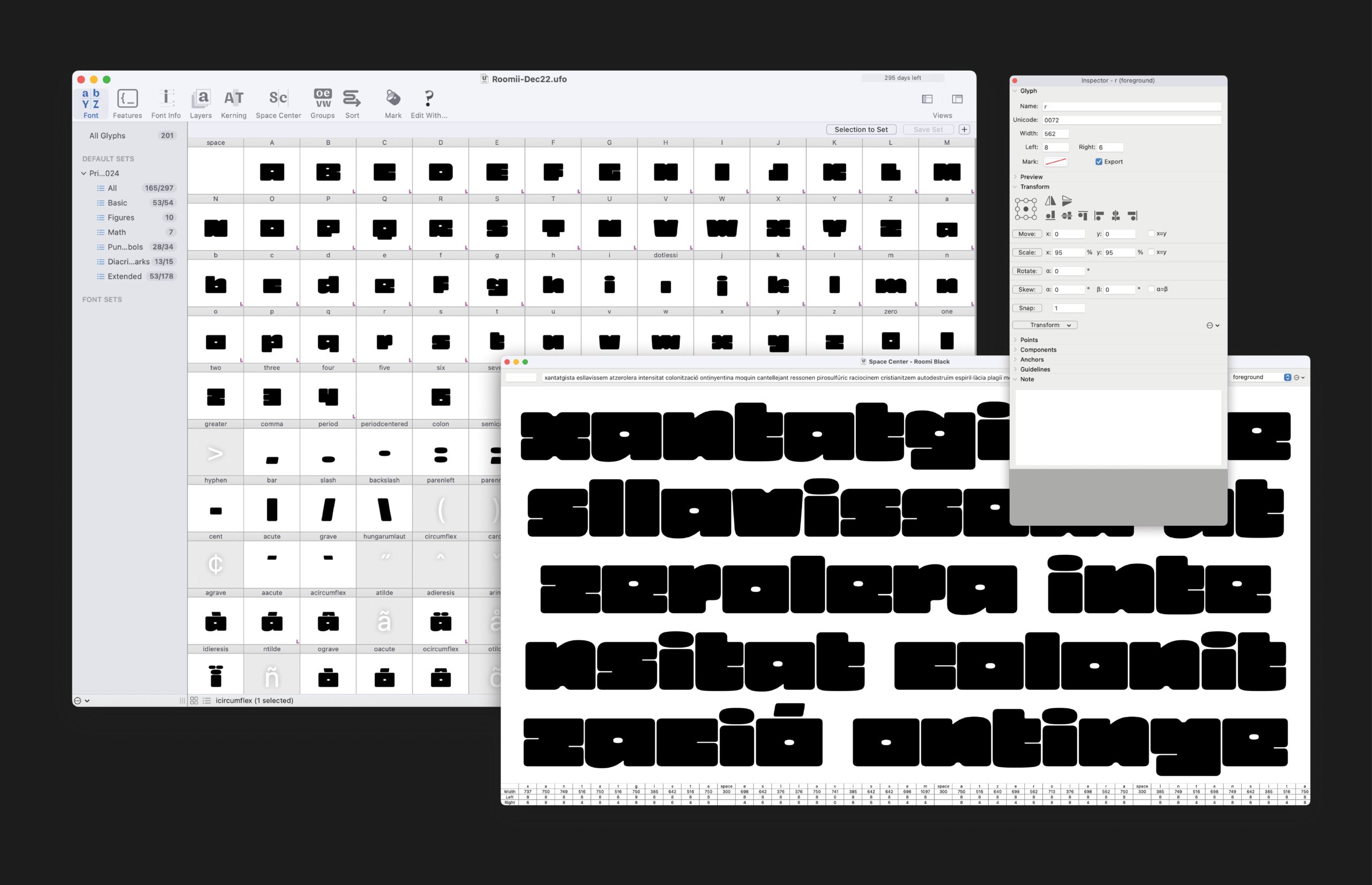
Moving into the digitization stage felt daunting. Not only were all these empty glyph boxes staring at me in RoboFont, waiting to be filled, but learning a new program came with its own learning curve. Starting with lowercase, I focused on perfecting the control characters, “n” and “o.” These glyphs established the foundation for the entire lowercase set, influencing the x-height and proportions of the font. As I created each glyph, I also focused on spacing, which I had initially assumed was done at the end of the process. However, I quickly realized its importance, as proper spacing directly impacts how each letter appears and interacts with one another. For uppercase, we took a similar approach, beginning with “H” and “O” to define the structure and consistency for the rest of the set.
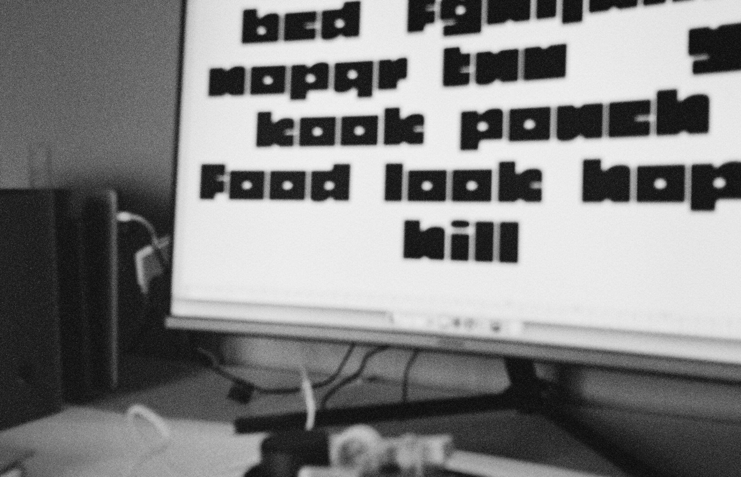
Throughout the process of creating both uppercase and lowercase glyphs, I found it interesting to learn how certain aspects of letterforms influenced one another, and how elements from one letter could be adapted and used to create others. Once the uppercase and lowercase sets were finalized, we tested our font, made tweaks, and briefly learned about the importance—and labor-intensive process—of mastering and preparing a final font file.
Outcome
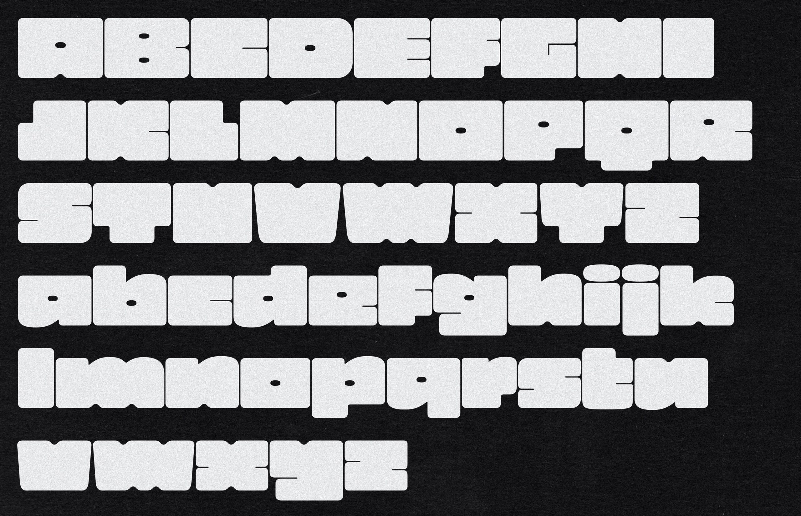
Roomii Display is still a work in progress. I’ve completed uppercase, lowercase, numbers, and some punctuation, but I plan to keep refining and expanding it with the goal of finishing a full character set. Taking this course was incredibly fulfilling, as I was able to further explore my passion for typeface design. I became more comfortable iterating, embracing the messy creative process, trusting my judgment, and assessing my work more critically.
Credits
Design: Olivia Montagnese
Instructor: Zrinka Buljubašić
