Workplace Safety and Prevention Services
Website Design, UI & UX, Digital Strategy, Accessibility Compliance
Workplace Safety and Prevention Services
Website Design, UI & UX, Digital Strategy, Accessibility Compliance
Workplace Safety and Prevention Services
Website Design, UI & UX, Digital Strategy, Accessibility Compliance
Workplace Safety and Prevention Services
Website Design, UI & UX, Digital Strategy, Accessibility Compliance
Workplace Safety and Prevention Services
Website Design, UI & UX, Digital Strategy, Accessibility Compliance
2020
2020
2020
2020
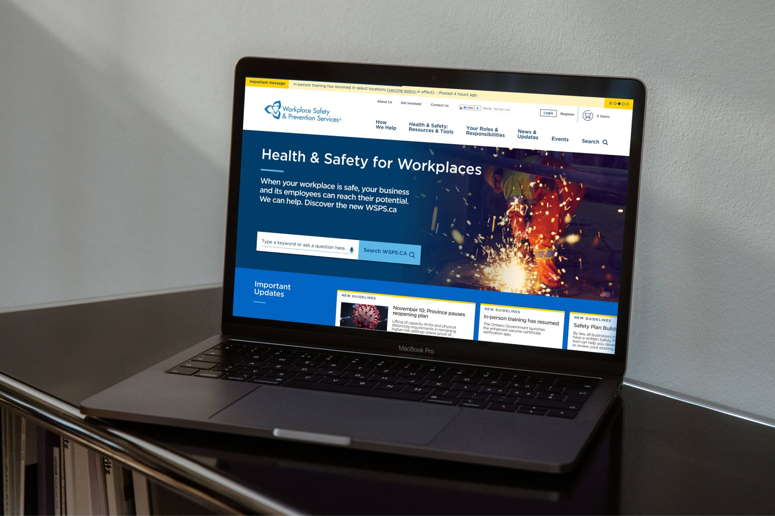
Workplace Safety & Prevention Services (WSPS) is a not-for-profit organization committed to protecting Ontario workers and businesses. As the largest Health and Safety Association in Ontario, they support the agricultural, manufacturing, and service sectors, throughout the province. A redesigned site was needed in order for stakeholders, customers, and industry experts to have a more seamless experience in accessing the latest health and safety information.
Supporting over 4.1 million people, WSPS has been a partner in Ontario's occupational health and safety system and a trusted safety advisor since 1917. Their website serves to be an integral part in providing both businesses and individuals with information and support through their extensive resource hub, training courses, webinars, case studies, events, and more. Prior to the redesign, the website appeared traditional and lacked a distinct and cohesive visual aesthetic. It was not compliant on mobile and the site structure was very disjointed, making it difficult for individuals to locate the information that they needed.
Experience
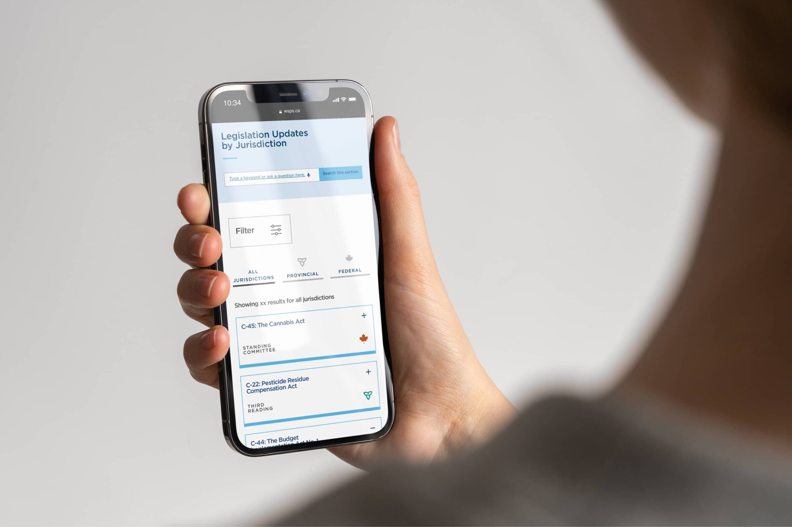
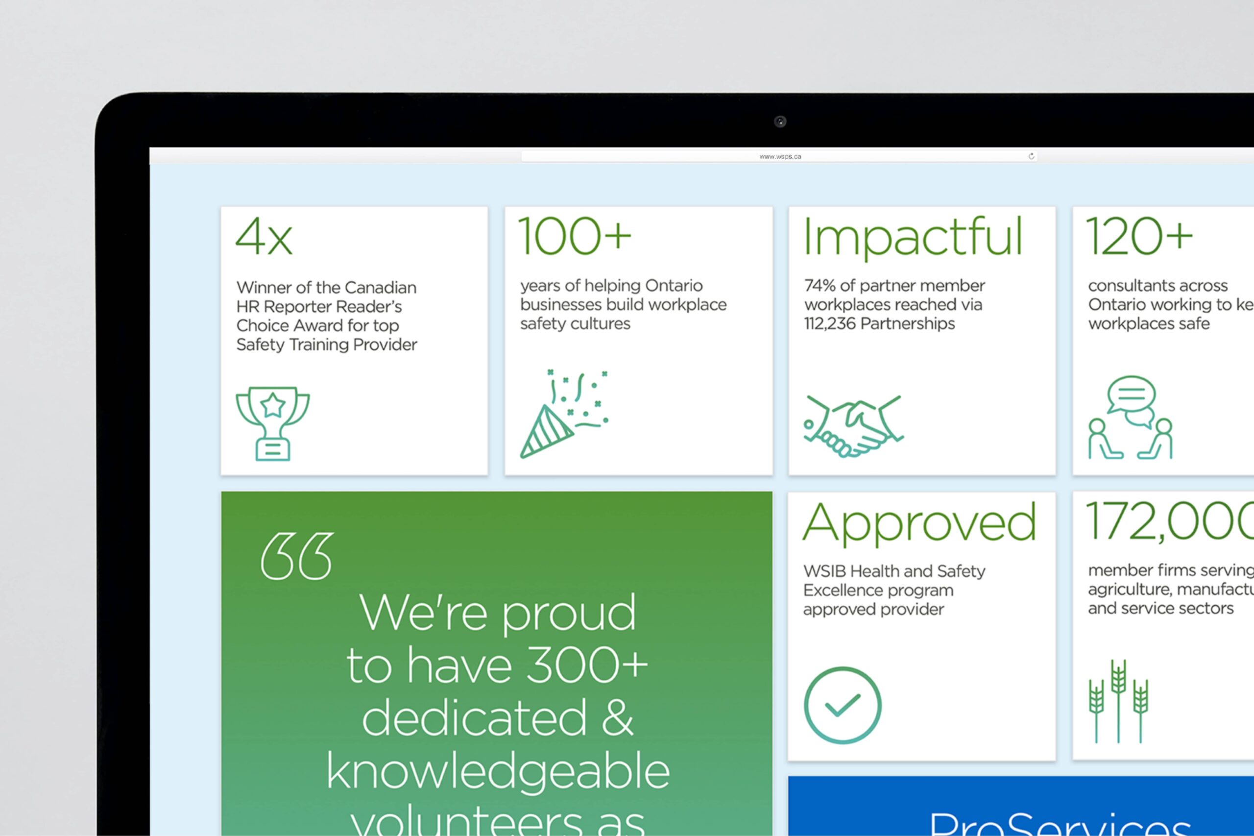
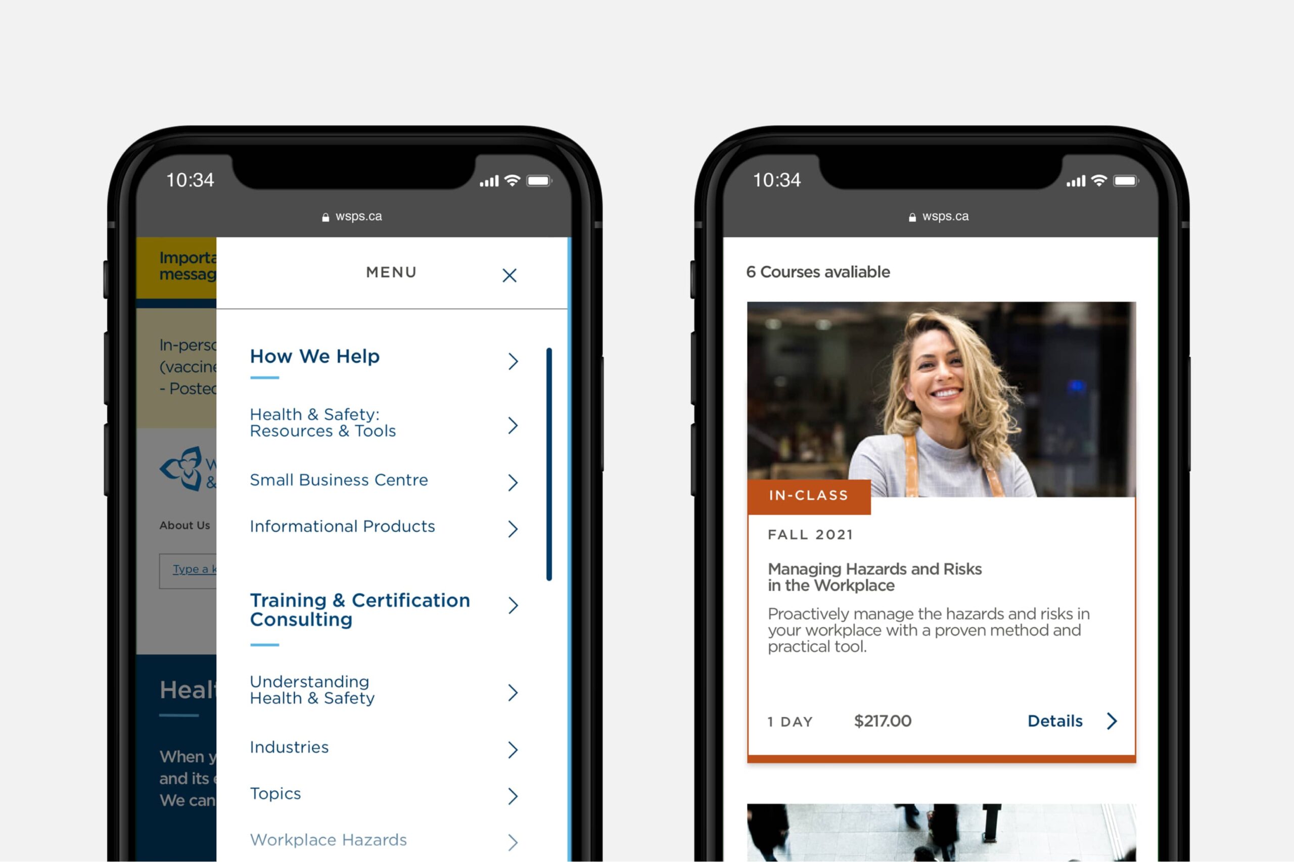
The process of working on this project was one that was very collaborative and immersive, not only with the internal team, but also with the client, where we were able to dive deeper into the organization and solve problems together at each step of the process. I was also able to gain extensive knowledge in the digital and UI/UX realm while working alongside my colleague. With a revised sitemap, information is organized in a manner that makes it easier for individuals to access the organization's content. External inspiration was referenced throughout the design process in order to achieve the most effective functionality for the site on both a desktop and mobile. A very important aspect of WSPS is their online shop where individuals are able to purchase training courses that take place in a variety of formats; including in-class, self-paced, e-courses and webinars. Icons for each format were designed, in order to correspond to the coloured tagging system on the training pages. Being able to create these icons was very fun and definitely adds more individuality to the site.
Outcome
The new website AODA compliant, designed from a mobile-first standpoint, is accessible on all devices, and and gives WSPS a more elevated and distinct visual identity. The new site was launched to the public in 2021.
Credits
Designed at: Gene (Formerly Cossette Health)
VP, Design: Tejashri Kapure
Graphic Design: Olivia Montagnese & Tejashri Kapure
Sr. Project Manager: Jing Han
VP, Client Success: Jill de Larzac


